
At 3rd Rail, we understand that colour management in screen printing can be a complex task. It requires a deep understanding of colour theory, print technology, and substrate qualities. That’s why we’ve compiled a list of the top 10 most common questions we receive about colour in screen printing (along with their answers).
Our aim is to empower brands and creators to make informed decisions when creating their custom merchandise.
1. What’s the difference between RGB and CMYK colour modes, and why does it matter in screen printing?
RGB (Red, Green, Blue) and CMYK (Cyan, Magenta, Yellow, and Key/Black) are two different colour models used in digital and print mediums, respectively. RGB is used for digital displays, such as computer monitors, smartphones, and televisions. It’s an additive colour model where red, green, and blue light are combined to create different colours.
On the other hand, CMYK is a subtractive colour model used in printing. The colours Cyan, Magenta, Yellow, and Black (represented by the ‘K’) are mixed to create a wide range of other colours.
Even if your design is in RGB mode, it can be matched to the closest colour from your files. Therefore, it’s better to design using the RGB colour mode within your application of choice. It’s crucial to understand these colour models to ensure your expectations align with the final output of your screen printed merchandise.
2. How does screen printing manage to produce vibrant colours on dark garments?
Screen printing on dark garments requires a process called ‘underbasing’. In this method, a layer of white ink is first printed on the dark garment, creating a ‘base’ for the other colours. This white base ensures that the subsequent colour inks remain vibrant and stand out on the dark background.

Think of underbasing like using a white canvas for painting: the colours pop and stay true to their original hue. Without the white base, the colours may get lost or altered by the dark background, leading to a less vibrant print.
3. Why do colours look different on the screen compared to the final printed product?
The discrepancy between the colours seen on screen and the final printed product often comes down to the different ways screens and prints produce colours, as explained in the first question. The discrepancy between the colours seen on screen and the final printed product often comes down to the different ways screens and prints produce colours. Screens, like computer monitors, use a combination of Red, Green, and Blue (RGB) light to simulate colours to the best of their ability. Furthermore, screens are backlit, which allows them to produce colours that can be brighter and more vibrant than what can be produced by physical inks.
However, the calibration and variance of different screens can cause these simulated colours to look different from their real-world printed counterparts. Monitor settings such as brightness, contrast, and colour profile can significantly affect how colours appear on screen, and these settings often differ from one device to another, causing variability in colour representation.
To minimise these discrepancies, professionals use tools like Pantone Matching System (PMS) for a standardised colour matching across different mediums.
4. How can I ensure accurate colour matching in my screen prints?
Accurate colour matching in screen printing relies on several factors: the quality of the original artwork, the inks used, the screen printing technique, and the colour of the substrate. Using the Pantone Matching System (PMS) can significantly help in maintaining colour consistency.
PMS is a universally accepted colour system that allows printers to match any colour with great precision. It contains over 1,800 unique, numbered colours, so you can communicate your desired hues precisely, regardless of the equipment or the language spoken.
5. Can I print gradients and shades in screen printing?
Absolutely, gradients and shades can be printed using a technique known as ‘halftoning’. Halftoning uses small dots of different sizes and spacing to create the illusion of a continuous-tone image. When viewed from a distance, these dots blend together in the eye, creating the perception of gradients and shades.
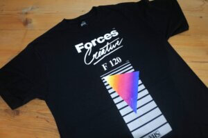
Remember, however, that achieving smooth gradients can be challenging and requires expertise in screen preparation and ink selection. Therefore, it’s crucial to partner with an experienced screen printer for the best results.
6. What does ‘colour fastness’ mean in screen printing?
‘Colour fastness’ refers to the resistance of a print’s colour to various forms of fading or bleeding over time. This includes fading due to washing, exposure to sunlight, perspiration, or rubbing. High colour fastness is crucial in screen printing to ensure that the printed merchandise remains vibrant and appealing even after frequent use or washing.
Methods to increase colour fastness include using high-quality inks, proper heat curing, and specific aftercare instructions to end consumers, such as washing printed garments inside-out and using cold water.
7. What is colour separation in screen printing?
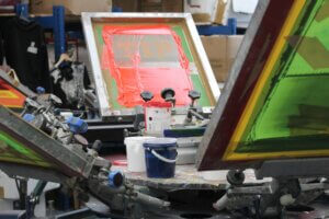
Colour separation is a crucial step in the screen printing process. It refers to the process of dividing a full-colour image into its individual colour components for printing. Each colour is printed separately – one at a time – onto the substrate and then layered to form the final image.
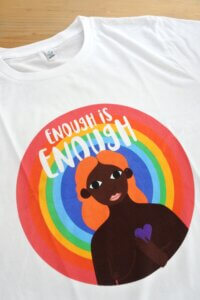
Imagine an image of a rainbow; each band of colour would be separated and printed individually, one on top of the other, to create the full image. Proper colour separation is essential for sharp, clear, and vibrant prints.
8. What’s the impact of substrate colour on my print?
The colour of your substrate (the material on which you’re printing, such as a t-shirt) can significantly impact the appearance of your final print. Light-coloured inks will appear differently when printed on a dark substrate compared to a light one. The ink may not show up as vibrantly, or it may take on a tint of the substrate’s colour.
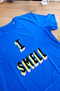
For instance, yellow ink printed directly onto a blue t-shirt may appear greenish due to the blending of colours. That’s where the ‘underbasing’ process mentioned earlier comes in handy to ensure colours stay true to the original design on dark substrates.
9. What are metallic and fluorescent inks, and how do they work?
Metallic and fluorescent inks are special types of inks used to create unique effects in screen printing.
Metallic inks contain tiny metal particles that reflect light, giving the printed design a shiny, metallic finish. Think of them as adding a bit of ‘bling’ to your design.
Fluorescent inks, on the other hand, contain pigments that are capable of absorbing light from the non-visible spectrum (such as UV light) and emitting it in the visible spectrum, resulting in incredibly bright and vibrant colours. These inks can make your design stand out, especially under UV light, making them perfect for night events or parties.
10. Can I use the same set of screens for different colours?
Typically, one screen is used for each colour in your design due to the colour separation process. However, if you’re printing a design with the same pattern but different colours (like a logo in different colour variations), you can clean the screen thoroughly and reuse it for the different colours.
Keep in mind that proper cleaning is crucial to avoid colour contamination. Also, this might not be cost or time-effective if you’re planning to print a large number of items, as each colour change requires a stop in the production process.
Navigating the world of colours in screen printing can be complex, but with knowledge comes empowerment. By understanding the answers to these top 10 colour questions in screen printing, you’re now better equipped to make informed decisions when creating your custom merchandise. Happy printing!